


Drew Wheeler
-
Posts
243 -
Joined
-
Last visited
Content Type
Profiles
Forums
Events
Store
Posts posted by Drew Wheeler
-
-
1. American Beauty
2. Moneyball
3. Casablanca
4. Shaun of the Dead
5. National Lampoon's Vacation
6. The Social Network
7. The Dark Knight
8. Forrest Gump
9. Forgetting Sarah Marshall
10. The Wrestler
A really weird list, I'll give you that.
-
Can I get this Samantha Starr on kyky?

Voila
-
REQUESTS:
-
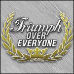
So since I bought TEW 13, I've been making event logos...I figured I would share them and if you guys like them, feel free to use them however you'd like.
Who, you're welcome to put them in your data if you're so inclined, as well.
Triumph Over Everyone
Truth Among Lies
Together We Dance the Dances of Death
The Missing Piece
Smells Like Grunge
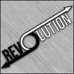
Revolution
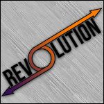
Revolution 2
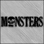
Monsters
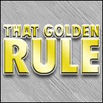
That Golden Rule
I Don't Like You
I Shall Exterminate Everything Around Me That Restricts Me From Being The Master
Blackened Sky
Crush Kill Destroy
War of the Nations
A Time to Kill
A Time to Kill
Hero Management
-
 1
1
-
-
I actually think Kelly Wiglesworth might be one of them. Shane was indicating that the alliance was maybe not super-obvious and that he was only working seriously with locks, and he's really reverential of her. If Kelly's playing the "I still hate alliances and I'm going to play the same way as I did in Borneo" thing as a smokescreen then that's awesome.
This. Kelly's return is for sure the storyline I'm most excited to see heading into the next season.
Generally pleased with the majority of the cast, I'm thinking this will be a memorable season.
-
I'll participate, I guess.
-
1. Biffy Clyro
2. Nirvana
3. Brand New
4. The White Stripes
5. Smashing Pumpkins,
6. The Beatles
7. Dashboard Confessional
8. Kanye West
9. Alkaline Trio
10. Weezer
11. Marvin Gaye
12. Bush
13. Frank Sinatra
14. Incubus
15. Wilco
-
1. "Puzzle" - Biffy Clyro
2. "In Utero" - Nirvana
3. "Vitalogy" - Pearl Jam
4. "Deja Entendu" - Brand New
5. "Elephant" - The White Stripes
6. "Unplugged in New York" - Nirvana
7. "Mellon Collie and the Infinite Sadness" - Smashing Pumpkins
8. "Only Revolutions" - Biffy Clyro
9. "The Devil and God are Raging Inside Me" - Brand New
10. "Get Behind Me Satan" - The White Stripes
11. "Nevermind" - Nirvana
12. "Graduation" - Kanye West
13. "Thriller" - Michael Jackson
14. "Swiss Army Romance" - Dashboard Confessional
15. "Golden State" - Bush
16. "Siamese Dream" - Smashing Pumpkins
17. "Make Yourself" - Incubus
18. "One Cell in the Sea" - A Fine Frenzy
19. "Eyes Open" - Snow Patrol
20. "Enter the Wu-Tang (36 Chambers)" - Wu Tang Clan
-
Very much like the Aries one. It's simple but effective and the copy is easy to interpret and enjoyable on the eyes.
I like the splatter effect a whole lot, but the diagonal white is almost taking too much attention. I'm probably being nit picky because on the whole I appreciate the piece.
Good work, sir.
-
I was infinitely depressed. I felt like this could have been a great episode but really the only big laugh I got was at Token's first reaction to Tyler Perry.
Pick it up, South Park.
-
My buddy texted me and asked for a logo for his fantasy baseball team based on the TRON: Legacy posters with Ryan Braun of the Milwaukee Brewers as the focus.
I obliged...and I loved the results.

So tell me what you think...

-
...I really should shill out the money for these tickets...oh my God, Arcade Fire, Lil Wayne, on the same bill?
-
Alarm, I feel like I've seen you somewhere before because I've seen these Crossbones, Jacobs, and Kendrick sigs elsewhere.
Where else do you/have you posted, bro?
-
I like it. It's really simple but I really like it. It's odd
Agreed. It's ridiculously, almost criminally simple. However, it works. The color scheme with your text outline and pinstripe background works well, it's visually simple and pleasing. However, personal preference here, I'd have only used one render of Velvet, and placed it differently, but for what you've done, it's tolerable.
I think this is fine work, but I wouldn't get comfortable in this style--spread your wings and try some different techniques, too.
-
The skin is burnt off and raggedy--Good. The hair is patchy and looks like it's been through hell--again, good.
I think the left ear should have more definition and less "burn texture", though.
The left eye and the left part of teeth is what's tearing me up, man. They look very forced. I think that the tendons or muscles in the mouth area should be more defined to make the teeth appear more realistically visible. The undamaged skin should also "flap over" (for the lack of a better term) the burnt skin. I suggest carefully using the burn tool or using faded black layers to create your own shadows to achieve this effect.
I will also stress that I'm very very impressed with your work and am not being nitpicky just to post. In actuality, being impressed moved me to give actual advice as you requested (rather than random comments as others have done).
-
Hell yeah for Billy Corgan and Simon Neil!
-
A. No Nip/Tuck love.
B. Jax tied for Number 38.
For shame, EWB. FOR SHAME.
-
1. Kurt Cobain
-Nirvana
2. Simon Neil
-Biffy Clyro
3. Billy Corgan
-Smashing Pumpkins
4. Jesse Lacey
-Brand New
5. Frank Sinatra
6. Robert Plant
-Led Zeppelin
7. Chris Carrabba
-Dashboard Confessional
8. Jack White
-The White Stripes / The Raconteurs
9. Dave Matthews
10. Johnny Cash
Honorable Mentions to Trent Reznor, Patsy Cline, and Conway Twitty.
-
1. Leopold "Butters" Stotch - South Park
2. Homer Simpson - The Simpsons
3. Eric Cartman - South Park
4. Krusty the Clown - The Simpsons
5. Randy Marsh - South Park
6. Jesus - South Park
7. Doug Funnie - Doug
8. Grandpa Phil - Hey Arnold!
9. Sideshow Bob - The Simpsons
10. Ned Flanders - The Simpsons
-
Full Voting List
1. Jim Halpert - The Office (U.S.)
2. Christian Troy - Nip/Tuck
3. Jax Teller - Sons of Anarchy
4. Dwight Schrute - The Office (U.S.)
5. Michael Scott - The Office (U.S.)
6. Sylar - Heroes
7. Sean McNamara - Nip/Tuck
8. Cosmo Kramer - Seinfeld
9. Jesse Katsopolis - Full House
10. Tommy "The Green Ranger" Oliver - Mighty Morphin' Power Rangers
Honorable Mentions to:
Michael Kelso, (from That 70's Show) George Costanza, (from Seinfeld) Quentin Costa, Kimber Henry, Matt McNamara (from Nip/Tuck) Andy Bernard, Toby Flenderson, Pam (Beesly) Halpert, (from The Office (U.S.)) Jemma Teller-Morrow, (from Sons of Anarchy) and Hiro Nakamura (from Heroes).
Edit: I left out animated characters, or else this list would most likely be radically different.
-
(Yeah, so this has taken a full week longer than I anticipated, but anyway.)
Hello ladies and gentlemen, and welcome to the Trophy Presentation ceremony! I'm Drew Wheeler, your host for the evening.
First off, thank you to Norro for the judging assistance! Your comments and wisdom are always widely accepted from me!
Folks, what a first round! Now to introduce our entrants:
NUFAN!
ROCKY FELLER!
THE MODERN WAY!
LORD NIBBLER!
From four entries, one rose above the rest, and the winner is:
THE MODERN WAY!
And for winning, as promised, here is the Trophy (zoomed for detail) to commemorate your first round victory!

and in Sig Size:

Which means it's now time for...
THE SECOND ROUND~!
Mr. Wheeler vs. Mr. Way...or Mr. Modern...
To be judged by:
Norro! (Should he accept.)
with the Topic Choosing Committee:
Nufan, Rocky Feller, and Lord Nibbler!
Guys, lets have a topic and size chosen by Monday, September 6th at 12:00 PM CST. This has been Drew Wheeler for the D.W.O.I.X.D.G.B.R.F.B.f.G. 2010!
I anticipate the topic announcement and I am looking forward to battling you, TMW!
-
Orton one is stylin', haha. Me gusto mucho. I think the render should be a little more visible with maybe a texture someplace and a stroke and it'd be very good, IMO.
Kobe feels a bit crowded around, like you said, but I'll add that it feels very "forced" if you understand what I mean. It's the colors being very aggressive, I think.
JC Bailey one is real nice. My only new complaint is that his face was more visible. That's just me, though.
I wish you'd have stroked the images after they were finished, I love the look of that. However, the blends and brushwork are solid enough and I like the styles of photos and renders you used.
Main suggestion, to beat a dead horse--Use Stroke on your finished images, man. It's good stuff to help the graphic "pop".
-
I guess I'm waiting on FnG still, to average out the scores and such.
But for anyone who isn't in the final round, you guys can gang up and decide the topic for Round Two.
-
nufan--I was extremely glad you included players. The one I envisioned as I conceptualized the topic had players and I was glad to see them. Moreover, the inclusion of Rookie players made me realize their role in the new season is a very big one. Great decision there, man. Speaking from the aesthetic side of things, I'm not huge on any of your text other than the players' names. The tagline was a good inclusion but I think with your layout, the NBA logo might have been sufficient. I go to either extreme on the faded zooming effect on the renders' underlayer. As of right now, I like it, though. Thanks for your hard work, man.
OVERALL-- 75/100
Rocky--Your entry brought something new to the table as well--the AUDIENCE! A. I loved the inclusion of the fans into the NBA letters, and the silhouette was a great touch as well! B. I also like the logos for the Conferences and all the teams being represented. C. I think together though, it looks very crowded. Almost too crowded for my personal preference. I think that your NBA logo with the audience really pulls your overall score back to life, though, it is extremely eye catching yet exceedingly simple. Thank you for your entry, Rocky.
OVERALL-- 70/100
TheModernWay--The one thing I most wanted to see was a wallpaper that looked like it was NBA-produced, and yours delivered completely. In my opinion, a wallpaper should have eye catching simplicity and it very certainly does. The (I think Rocky was pretty close but I'll say either a Basketball's texture or bubble wrap, lol.) textured background with the color splashing is very nice. I think that my biggest thing with yours is the words- "The new season." I dunno, could be nit-picky but I'd have preferred 2010-2011 or something similar. Thanks for your entry there, man.
OVERALL-- 82/100
Lord Nibbler--To not know a thing about basketball, you totally grasped the "Just Do It" attitude of basketball that Nike capitalized on. I'm into the visual imagery and the text on your piece--simply beautiful work, man. I think though, that my biggest compliment to you is also the biggest detriment. The NBA's worked and is working to move from the "street-ball" mentality and make the game more professional. I will still say though that your piece's PURELY SPORT OF BASKETBALL feel, particularly when you were in the dark about the concept and game, supposedly, were a breath of fresh air in the contest. Thank you, bud.
OVERALL--77/100
Thank you guys so much, and I guess we will just average the three scores together to find our winner before the "trophy" is awarded and the Topic for Round 2 is selected.
EDIT:
How about this--the three participants who don't move on to Round Three will be the committee who selects the Topic for Round 2. Sound good?


WWE Supercard
in Coin Op Arcade
Posted
Thus far, the end of Epic and the beginning of Legendary are...very tough for me. My exhibition rank is Legendary, but my divas aren't very good.
This thread is inspirational though. One day, guys...one day.