


Drew Wheeler
-
Posts
243 -
Joined
-
Last visited
Content Type
Profiles
Forums
Events
Store
Posts posted by Drew Wheeler
-
-
I like it... It's on theme, and you're not exactly drawn away to specific regions... It's viewable as a whole...
Only one picky thing

The colour is just cut off clean in the bottom right corner above your name.
After noticing it originally I'm drawn to it
 & now everyone else will see it
LOL.
Man, I'll be honest, I realized my name wasn't anywhere on the entry and didn't know if that was expected around here or not, so I wanted it to be moderately translucent.
-
Just post it mate, I was still ready to judge (Y)
Plus most graphics battles involve the posting of the pieces in the topic itself so some public dialogue can go on about them as well. Get some critique from others before/after the verdict is laid down to help you develop more and all that.
Sure man, can do.

And there you have it. Let the discussion commence, I suppose.
-
Alright, mine has been turned in to DMN.
Looking forward to seeing you guys' results...I found this to be a very challenging but rewarding topic.
-
Alright, it's on.
DMN and Norro will judge as a unit, and Saturday will be the deadline. Let's say we will have our wallpapers PMed to DMN on Saturday.
DMN's above listed rules will be the official rules and sizes.
Myself, FnG, and nufan are the competitors.
Good luck fellas.

-
If you need rules/theme, I'd be glad to offer some up. I understand if you want someone more graphically oriented to participate. I'd judge as well, if you like, although I'd have a purely aesthetic point of view, not technical ability.
Wallpaper
'Surfing a Sound Wave'
Pretty open ended, and I think you could do some cool stuff with that theme idea.
Well I'm pretty content with that challenging concept, DMN.
I've got Norro judging already but I don't mind having multiple judges by any means. The more the merrier, yeah?
-
Count me in too, if we can make the deadline saturday?
I'm content with Saturday, bro.
Nufan? Any objections?
-
Sounds good to me man! (I pilfered through your flickr and liked your work.) Is Friday good with you for a deadline?
Anyone else want in on this?
And can anyone suggest any topics?
-
I'd like to have a graphics battle, so consider this an open challenge to anyone in the GFX Forums!
I've spoken to Mister Norro and he's agreed to lend the judging hand.
So here's what I need:
-An opponent (or opponents, I suppose)
-Suggestions on a Topic and Size
-A due date that will work for both myself and my opponent(s).
Let's make the GFX forum interesting, huh?
-
I don't know if it's proper etiquette, but I liked it enough to steal it to use as the background on my phone. Solid work.
That's probably the best compliment my work's ever gotten so I could give a damn about whether there's etiquette in it or not. All yours, DMN.
-
Thank you all for your kind comments and constructive criticism. I appreciate it greatly.

-
10/10
I really, Really like it
Thank you, DJ. I appreciate your kind comments.
I really really like the excess of Layla photos you have around your posts haha.
-

Made this after reading the announcement and the participants. Let me know what you guys think.
(Generico cut from PSD Dreams, Background elements via Google Images, all other are my own cuts.)
-
For a desktop, in my opinion, it is far too busy.
Your background layer is stone-looking, so it's appropriate, I suppose.
The "Glass Shatters" text itself is fine, but perhaps unneeded. I'll strongly echo Sousa and Faarooq/Blue's sentiments as far as my bewilderment at the radioactive logos go, though.
I'm into the title belt's placement, and I like the main cut of Austin, but the rest of those logos and cuts seem unnecessary to me, I guess it's just going back to the "too busy" point I made earlier.
Overall, I will say, it's just too cluttered for my liking. Fair try, though.
-
1. Kevin Spacey
2. Brad Pitt
3. Tom Hanks
4. Edward Norton
5. Johnny Depp
6. Mickey Rourke
7. Leonardo DiCaprio
8. Morgan Freeman
9. Seth Rogen
10. Helena Bonham Carter
-
Three hands is an interesting idea, but if you're going with that why do the hands in the back have five fingers and the foreground one only four? Four across the board would simply be nicer.
Thank you Be for your feedback!
I am not entirely sure as to why I didn't take off or "break" some of the fingers on the back hands...but It's a great idea. I've got the PSD file and I'll play around with that idea. Thank you for the suggestion.
EDIT:
-

Threw this together, images from Google Images, and cuts from PSD Dreams.
Let me know what you think.
-
Something new, an Evan Bourne poster.

Cuts from PSD Dreams.
Let me know what you think, I am pretty big on this one's design and layout.
-
I like the background. Solid brushwork, not too busy which draws the attention to the cuts, I think the dark feathering around the edges might be a pinch excessive, but I like it still. I like the cuts of Undertaker, Orton, and particularly your main cut, Cena, but the Miz seems out of place because he isn't "posed" like the others. (I hope you know what I meant by that, haha.) I like the logo placement, but the only thing that turns me off is the way the tagline is sitting. The words themselves are nice, but I'm just not keen on how it's sitting.
Overall, I was pleased with it, man. I think it's pretty good work.
-

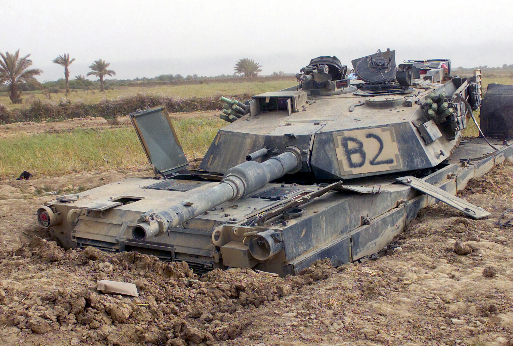
I got this idea from listening to his theme song today at work. It's not big enough to be used as a wallpaper, I think, but what do I know.
Cut from PSD Dreams.
Images used:
http://real-terrain.com/images/ruin.jpg
http://media.nowpublic.net/images//91/8/918daff501f6dc4d11373567e6f584c6.jpg
http://blog.lib.umn.edu/scha1028/architecture/american%20wasteland.jpg
http://upload.wikimedia.org/wikipedia/commons/f/fd/Destroyed-M1-DM-SD-04-03261.JPEG
Let me know what you think.
-
Just a few more I've made using Christopher Daniels. I typically like working with Daniels photos, but surprisingly I've never used this concept.

And without the text...

Let me know what you think.
(Cuts from PSD Dreams.)
-

First bit of work I've done in a while and why not Jimmy Jacobs.
Let me know what you think.
-
CHIKARA's two newest students, Escorpion Egipcio and Frightmare:


 & now everyone else will see it


I'll Have A Battle, Please
in Mods/Scenarios and Graphics
Posted
Ahhh, I understand.
Thank you Norro, Rocky, and Sean for the constructive criticism. I guess in my sweep over checkI missed the tail end of the fade. Technical error, I think. :/
Anyway, I am pretty excited to see what FnG and nufan can come up with.