


Ignition
-
Posts
322 -
Joined
-
Last visited
Content Type
Profiles
Forums
Events
Store
Posts posted by Ignition
-
-
Seems a rather dull single with not much to it for me. I think I prefer their older stuff
-
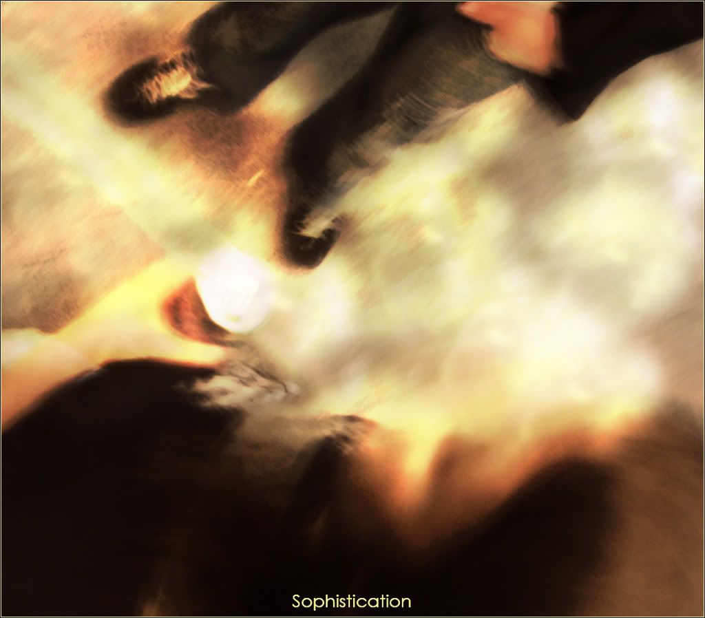
I didn't know what "title" to have. The word sophistication came to my head, like having a beer with a friend and the general feel to the grahic. Sorry the title doesn'treally match the image, I think it's more of a personal thing. Any opinions on the graphic itself?
-
Just something I did after taking some photos in London Bridge. It's supposed to be a kind of out of body shot, mixed with some blur and editing for effects. Kinda a tongue in cheek meaning of sophistication. I don't know if I like it or not, but I thought I'd share.
-
Really like the first, bu the second one is far too dark and hard to make out.
-
What program are you using? Are you using paint? I suggest getting Photoshop. If you're using photoshop then check out some tutorials on here or any tutorial site on some basics of how to do a few things. Also use high quality cuts from PSD sites or use a cutting tutorial.
-
The problem with Cole's method is that then if you later decide you want to alter some of it, you've pretty much got to start again.
My method is to create a layer mask then use a soft edged aprrox 100 pixel brush and use that on the layer mask. That way if later on you decide you don't want it you can delete the layer mask or just start again. It's a useful tool.
-
Border
I dislike the thick black border. Make it 1 pixel or if you want a bolder border then 2 pixels.
Background
For the most part I like the backgrounds, but I think that the contrast is too high (It's too bright). I prefer the contrast in your signature banner.
Cuts
Agreed, no point in using the same cut twice in the background.
Try bringing the center cut to the front so that it's on top of everything and then you have a sortof center piece to the sig, it's not quite the same and it's not my best work but here's an example of what I mean:
Text
Move the black border up to the very top layer so that the red glow from the text doesn't overlap the border.
Also lower the opacity of the red glow and make the size of it smaller. Maybe try other things with your text in future, such as trying white text, trying to use less glow, etc.
-
I thought it would be a nice idea to post all of our created graphics for Benoit in this topic. Here's my splash.

-
The red outer blur/glow on the text you need to get rid of dude. Just to make sure you understood my previous post.
-
I like it, but the red glow around the text ruins it a little bit more me. Try changing the colour of it to a darker red so it blends in with the background a little more, and make the opacity less...Also maybe try without a glow/drop shadow.
-
You're the guy in charge, do whatever you want
 Just get something up
 -
Wow! Thanks for third place
 I shall definately enter June......*cough*when it's up*cough*
 -
I posted a tutorial just follow it.
-
I really like the Jimmy Rave text. I agree that most of your text is very good (which is one of the hardest things). I don't really know what else to say about the rest. Some of it I like (eg foo fighters), some of it is far too busy (Jeff hardy/judgement day)
-
Agreed with the above two posts.
I'm digging the blur effect with the text being sharp, but it needs to stand out more.
Also try making the bg be more than his face three times.
-
DOT COTTTON! It's on like Donkey Kong!!!!
Seriously, sorry for pestering about the judging, just really looking forward to see if i can grab a bronze.
-
So the results?
I'm in need of some june contest entering too

-
1/ Put the brushes in the right folder
- First of all you need to put the brush file (unzip if needed) in the brushes folder. Should be something like:
C:/Program Files/Adobe/Photoshop/presets/brushes.
2/ Select the brush feature
- Open up photoshop and click where the red circle is (on the little brush).

3/ Click the brush tab
- Click on this tab in the top right corner:

4/ Right click the arrow on the brushes tab
- Right click on the little arrow (where the red circle is):

5/ Click "Load Brushes"
- A little menu will apear. Click "Load Brushes" and then select the brushes you want to install.
-
Defiantely. When you think of the amount they spent. Give me like £100 and I would of done one.
-
That looks shit.
End post.
-
You could try sharpening them. Other than that the only thing I can think of is to resize them to a smaller size.
-
- Bring the TNA bound for glory logo to the front.
- Get rid of the TNA logo and the 18 logo, as they look totally out of place.
-
- Bring the TNA bound for glory logo to the front.
- Get rid of the TNA logo and the 18 logo, as they look totally out of place.
-
No judges??
 Just get something up
 I shall definately enter June......*cough*when it's up*cough*
August PPV Poster Contest
in Mods/Scenarios and Graphics
Posted
Very nice kempay. That's my favourite one so far.