


Ignition
-
Posts
322 -
Joined
-
Last visited
Content Type
Profiles
Forums
Events
Store
Posts posted by Ignition
-
-
the newer one is really sweet i think. The old one is good, but a bit plain. I prefer the newer.
-
thanks rated r. Wanted to keep it simple because most of my graphics often use a few too many brushes/effects if anything. So I just tried to focus on the eyes, and yeah the Kurt Cobain text does suck, but i wanted his name on it. I'll remove the bevel and mess with fonts...maybe stick the nirvana logo on it instead.
thanks for the feedback.
-
Okay. Just thought I'd see if I get any feedback here, I'll probably start posting more images over here as well.
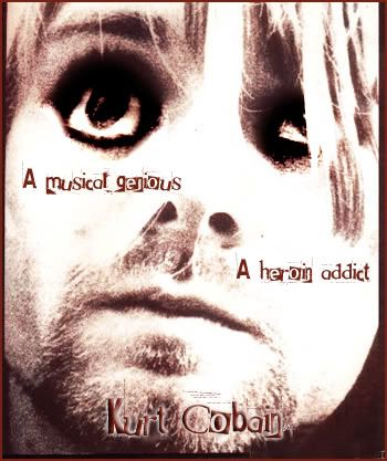
I tried to make his eyes like that to show the heroin (darker) side of him.
-
meh. isn't it jsut the hulk pasted over zidanes face?
-
what's this for? A website? Or is it just the graphic?
If it's just the graphic then it looks like you're saving it incorrectly. Save it as a jpg and then upload it to photobucket.com/imageshack.us/any other one, and it'll be fine. I don't know why you have white.
-
Yeah you're still very new to graphics dude. Good to see you trying to get some feedback over here as well, tyler gave you some good advice so i don't need to repeat anything.
Just keep it up, don't rush things and if you think somethings not good enough delete it and start again...thats me personally though, because sometimes you can spend a couple of hours trying to make something crappy look ok when you could make something fresh in less than that.
-
The text is very good. Backgrounds good for what it is, but the lines around beckham really puts me off as mentioned above.
-
True. I like the background though. It looks nice.
The blending needs a fair bit of work though and the text doesn't look right.
Pretty nice graphic overall though.
-
Haha. that really is awesome! Would he actually get the million though? I doubt it.
-
I agree. The cuts on the first piece is what's bringing it down.
First piece
- The text placement on the bottom is random. Either have it centered and center alligned, or on the left and left alligned.
- Work on the cutting.
- Possibly fade the two back cuts in to the background to make it feel less full.
Second piece
A lot better because you can't see any dodgy cuts. However:
- I dislike the way the wrestler is just in the middle bit and not outside, doesn't quite work for me but i understand what you were trying to do.
- Text is alright but needs a bit more contrast from the background.
- background is once again pretty nice.
-
<select>

  <option>FIRST THING HERE</option>

  <option>SECOND HERE</option>

  <option>ETC</option>

</select>
-
Design a poster portraying an emotion. Must be/contain:
- 300-500x300-600
- Text stating the emotion (eg: "Love", "pain", etc) (it can have other text as long as it has this in as well)
- No premade backgrounds or anything like that.
Quite original rules, are they ok?
Due: Thursday 9th March
-
yep very simple, the way you want it.
My negative feedback, would be that the bits at the top kindof make the logo bigger than it needs to be...Like if you stuck that on something there would be empty space around the little bits at the top.
Maybe just edit them and then it'll be good.
-
6/10
It fits together well and looks pretty nifty, good text with it as well. it all fits in nicely, but yeah you know I'm big on backgrounds etc.
Sig
in Mods/Scenarios and Graphics
Posted
Agree with everyone else. Awesome blending and effects, but the text really really lets it down. The black doesn't work..perhaps try some whtie text or do something different.