


Ignition
-
Posts
322 -
Joined
-
Last visited
Content Type
Profiles
Forums
Events
Store
Posts posted by Ignition
-
-
You mean a cut of someone? The easiest way is to go to a site which has PSDs. PSDs are images which are already cut and then you can just copy and paste them in to your graphic, nice and simple. If you want a part of a picture you can cut it out yourself by either erasing the other parts of the picture, or selecting it with the selection tool.
-
Agreed. I say remove the Christian Cage text as it brings the graphic down and just make the text in the back a bit bolder (and complete), but i like it, very nice

-
yeah i think that's what I was trying to say DoubleX. Make it longer for a poster or less long for a banner.
-
Thanks. I got stuck with all the fonts and it got to 4am so I gave up and left it as it was. I might edit it later tonight.
-
-
Nice entry. JTE, your's is amazing. I was going to enter but I don't see much point.
-
tut tut tut. My help not good enough

I kid, I kid...
I know there are a lot of better designers here so I hope you get some help. I'll give you some feedback:
The Good:
1/ I like the background for what it is. Like I said before it's good to either use a stock or to start with brushes. I think it looks fine, but without brushes it is often harder to integrate cuts in to the background, especially for people who aren't fantastic in photoshop.
2/ It has a nice theme to it. The sun over the city, you just need to rethink the things below.
The Bad:
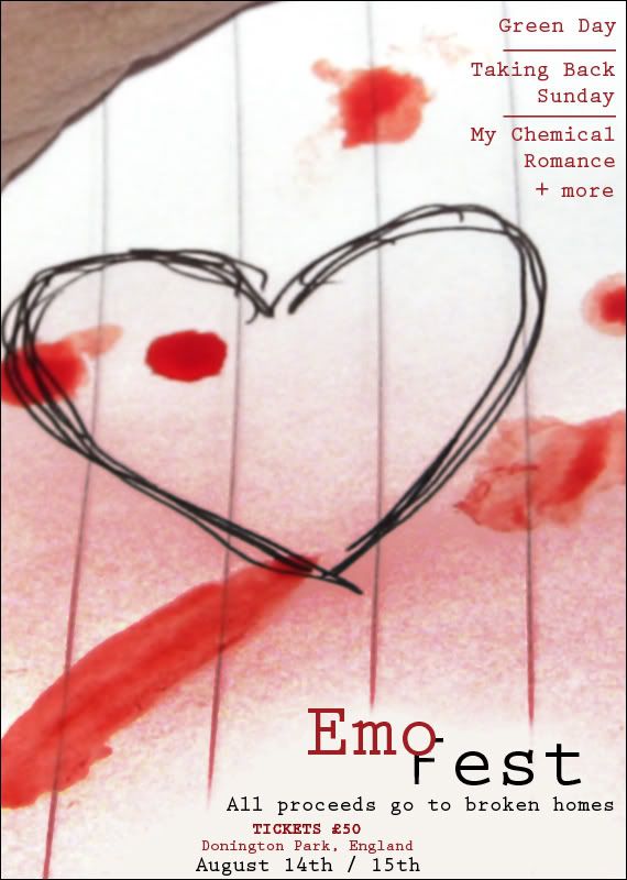
1/ It's a weird size. It doesn't look like a banner, it looks like it's supposed to be a poster. Maybe that's just to do with the placement of the logo.
2/ Add more information like date, time, a WWE logo? Make it look more official.
-
I doubt it'e Beckhams send off. I'm glad he's back, I don't see why he can't perform really well. I say drop Lampard and have the midfield be: J.Cole,Hargreaves/Carrick,Gerrard,Beckham. I think that's very strong.
-
-
I love it. It's not overpacked, the logo looks cleverly made. I also like the effects used on the cuts as it adds to the theme of the DVD cover.
-
The bottom of the poster is really well done. The black and red works very well and is nice and clean. I really like the whole bottom half of the poster from the logo-down.
The cuts are good and well sized.
The event name should stand out more rather than having blood or whatever over it. The top background isn't amazing and I think it would be better if it was a darker red to go with the red text.
-
Yeah i do the same as dochappy.
-
I'm studying video production and sound design at university.
The industry standard for Video editing that wer are using is called Media 100.
One of the industry standard for Sound editing is Pro Tools.
Both are made for Macs, but there are versions available for non-macs.
-
thanks LK.
Cheers AD. I agree with that. It does look like a generic photoshop background, but i thought it looked pretty cool. I could base it off a stock for sure, but i'd have to either start again or mess around with it quite a lot to fit it in. Probably easier to start again.
With the text, I just went for simplicity, because i don't like strokes/bevels i just kinda went for a basic white text.
-
no cloud filter used, just brushes, different blending etc. Thanks for the comments so far. I agree the cut doesn't work, I spent ages trying to get the cut to look good, but it doesn't quite work.
-
justin timberlake - Sexy back - what a fag, and what a crap song.
-
I think the new ones are better. Sorry, but on yours the light coming from behind angle really ruins the banners. and with the new ones they fit in well together (even though they're pretty simple and the text sucks).
-
Bit out of practice, want to get back to making some graphics and do a few battles. Any feedback?
-
Just got back. Slayer were awesome!!! I'm 6 foot 3, skinny but still damn heavy and i managed to crowd surf!!! wooooot!
-
Eugh worst episode of south park in ages imo. The ending was harsh, which can be good, but the episode generally wasn't funny at all. The first half of season ten was really good, and it's been downhill since.
-
Slayer headlining with Il Nino, lamb of god, and some other bands at the Brixton Academy.
I'm off there with a mate, anyone else heading down there?
-
Metallica did an awesome cover of "So What". Originally by the Anti Nowhere league. More of a comedy song, but the lyrics are so fun and it's an awesome song.
-
i like the font, but i agree with others about it being too bright although i feel some have been a little over critical.
-
was on TNA.com early on and there poster looks crap compared to this,


Help?
in Mods/Scenarios and Graphics
Posted · Edited by Ignition
Cuts
DeviantArt
PSD Protocol
PSD Spy
PSW gfx
There are a few. I'm sure there will be more in a thread on here somewhere.